Remember the old Facebook user interface? Nope, no one does. Interfaces are forever changing and although adjusting to the new layout may be frustrating at first, you quickly get used to the updated navigation and finding what you need. Now it’s LinkedIn’s turn for a face-lift and as much as we hate change – especially when it disrupts our everyday life – it’s time to get past the annoyance and start accepting the new and improved (sort of) LinkedIn.
This quick guide below will:
1. Posting an Update. Take note of the opportunity to share your updates with the public or just your connections. Depending on the content, it’s a nice new feature to have. And while we’re on the topic of sharing, avoid the temptation of sharing to “Public + Twitter.” Even if you have your profiles linked – each social platform should have its own, specific content.

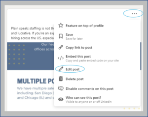
2. Fix your mistakes. If you make an error while posting, don’t fret. You can now edit the content. In the past, this was a feature exclusive to mobile, but it sure does help us desktop users.
Because really, who’s perfect?

3. Write an article. Previously called a “Post,” here’s where you can publish a blog or article you’ve written in its entirety.

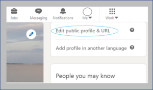
4. What are people seeing? You can no longer “View Profile As,” but the “Edit Your Public Profile” section will give you similar options, like seeing what’s being shared publicly. Take note of the “Add new profile section,” too. That’s where you want to go for updating your experience and adding skills and accomplishments.

5. #Hashtags. Yes, hashtags have made their way to the LinkedIn platform. Previously seen exclusively on the LinkedIn mobile app, hashtags are now available on desktop views. A great tool for searching trending topics, industry news or jobs. Just remember, LinkedIn isn’t Twitter, so use hashtags sparingly in your updates.
Once you’ve taken the time to find and familiarize yourself with some of the major updates of LinkedIn you’ll get past the fear of change and realize the new user interface isn’t so bad!